January 31, 2012

Megapixels

January 31, 2012

There should be a few new ASP-C sensors out this year, and I was curious as to whether the pixel density is following an exponential or geometric curve. As I'm a student of the scientific method, I thought I'd get some data and have a look. That is the figure below.

ASP-C Sensor Megapixels

I will note that the exponential (exp.) and geometric (geo.) curves in the above figure are just drawn there, there was no fitting done. There are, of course, lots of ways to draw these curves, I just did what looked best to me in November and December of 2011. It looks like the issue is already somewhat resolved with the latest data points. It wasn't so clear a few months ago when I first made the figure. The data was sourced from the Canon, Nikon and Sony camera pages on wikipedia.

Also, I'm staying out of the argument of if these pixels are needed or not. I won't be upgrading my DSLR body for some time.

January 30, 2012

Pan Blur

January 29, 2012

The texture of this is something I really didn't expect, it looks like these were made with a paint brush to me. There aren't any special effects applied, even the LR Clarity slider is on the positive side of zero (that is making more clarity, less fuzziness). I was inspired to try this by a picture that appeared on Juha's Light Scrape blog last week. I think it had been on my list of things to try for some time before that.

Forest Impressions I

Forest Impressions I

France (2012)

Forest Impressions II

Forest Impressions II

France (2012)


I'm looking forward to applying this technique to some other scenes, I'd like to try something horizontal, or even a swirl. These were with 1/10 and 1/8 second exposures, respectively, I want to play around with that to see what else is possible. Should be fun, it's a really great way to get some smooth colors.

I also found out that this is called 'pan blur'.

January 29, 2012

Last Driving Pictures

January 29, 2012

I took these yesterday, and I really like the first one. I'm liking the project, so I'll keep working at it, but I think I'll slow down on the broadcasting of these, at least until I've got some cohesive body of work.

Driving Pictures

Driving Pictures

France (2012)

Driving Pictures

Driving Pictures

France (2012)

Driving Pictures

Driving Pictures

France (2012)

January 28, 2012

Some More Driving Pictures

January 28, 2012

A bit of sunshine this morning, so there was a bit more color about.

Get Away

Get Away

France (2012)

Layers

Layers

France (2012)

January 27, 2012

Fly

January 27, 2012

Fly Away To Me

Fly Away To Me

Utah, USA (2011)

Big News! We bought our plane tickets back to the US for this summer!

January 26, 2012

Driving Pictures

January 27, 2012

Driving Pictures

Driving Pictures

Switzerland (2012)


The roads are narrow, the drivers are fast. I'm exploring a project called "Driving Pictures". Just a note: I'm the passenger in these picture.

Driving Pictures
Driving Pictures
Driving Pictures

And something with a little bit different crop.

Driving Pictures
Driving Pictures

Lines

January 26, 2012

Speaking of those institutional colors...

Lines

Lines

Switzerland (2012)

January 25, 2012

Parking

January 25, 2012

The place that I work is pretty monochrome, or just tri-tone. There is the institutional blue color, the institutional red color, and then a couple of white/off white/tans that are allowed. There is another color blue, but it could easily be just a faded version of institutional blue. Of course, there is also the ubiquitous "exterior decay" color, that's just everywhere. Consequently, the only real colors, especially in winter, are the cars. And when you really look at it, there aren't that many colored cars here either.

Parking

Parking

Switzerland (2012)

Parking II

Parking II

Switzerland (2012)


I've been thinking of themes and ideas for organizing some pictures on here, maybe the tri-tone theme I mentioned could be put to use.

January 24, 2012

Technical Reprise

January 23, 2012

Technical Wall

Technical Wall

Switzerland (2012)

This is one of the walls in the engineering hall next to my building, or maybe it's just a machine shop. It can be hard to tell. This room has both machining equipment and science equipment. I suspect it is a dedicated suport hall for one of the rings. Outside there are many brown (painted) gas bottles The gas bottles are next to the next building over (pictures another time). It's the same room that the pictures in this post were taken in.

Correction: gas bottle correction.

January 22, 2012

1, 2, a few, many

January 22, 2012

1

1

France (2012)

The Mossy Stump

The Mossy Stump

France (2012)

Lunch Tables

Lunch Tables

Switzerland (2012)

Light Ports

Light Ports

Switzerland (2012)

January 21, 2012

Down and Up

January 21, 2012

Some complementary-ness.

Down

Down

Switzerland (2012)


Up

Up

Switzerland (2012)

January 19, 2012

Technical

January 18, 2012

Crane Rail

Crane Rail

Switzerland (2012)

Nest

Nest

Switzerland (2012)

January 18, 2012

SOPA

January 18, 2012

I oppose SOPA.

January 17, 2012

Up High

January 17, 2012

Two things come to mind in these pictures.

  1. Taking pictures from up high is interesting.
  2. Taking pictures of people feels a bit creepy to me.

I think I'll only comment on the first one today. The second I'll save for later.

Atop R1

Atop R1

Switzerland (2012)

I haven't gotten to take pictures from up high in an urban (or really, an industrial) setting before. As usual, I struggle with the chaos of these settings, though I usually find something that I would like to make a picture out of. Being up high makes it for a different perspective. I usually want a longer lens, but wide offers some interesting ideas too.

And now the people shot:

Crosswalk

Crosswalk

Switzerland (2012)

January 15, 2012

Sunset

January 15, 2012

This picture goes back to last June. I was motivated to wade through all the pictures I took of this picture by the idea of playing around with it in LR4 beta. It was pretty fun.

Sunset

Nevada Sunset

Carson City, NV (2011)


I had taken a similar photo on a different day when the sunset wasn't so dramatic, but the trees and hill still really said something to me:

Sunset Over Toiyabe

Sunset over Toiyabe


Picking that second picture was much easier, the situation was pretty static, so I framed a couple of pictures, pressed the shutter and was done. That was it.

The next day there were some clouds, I headed out, stood there, and literally took over 100 pictures. I just kept shooting, and the clouds and light kept changing. It was great! When I got back to my computer, I had a ton of pictures to pic through, and they all looked good, just a little different. So which one do I pick? That would be why I haven't put up a picture of it yet. That, and the whole "don't over do the sunsets (or flowers) thing". Sunsets are great, everyone loves sunsets, but it does get a little boring when all you see is pictures of sunsets. So I try to only do a couple a year. That is, put pictures up. I make pictures of sunsets and sunrises as often as I can! But only I get to see those....

Enjoy that top picture, it'll be a while before I put up another sunset...

January 14, 2012

Silent Saturday

January 14, 2012

Maybe I'll be more wordy tomorrow....

Tree

Tree

Switzerland (2012)

January 12, 2012

Some Views Around The Workplace

January 12, 2012

Kind of a Long Day today, so no words.


layers

Layers

Switzerland (2012)

Break Room

Break Room

Switzerland (2012)

Copper

Copper

Switzerland (2012)

reflection

reflections

Switzerland (2012)

Up

Up

Switzerland (2012)

January 11, 2012

Photo Critique

January 11, 2012

I made it onto The Discerning Photographer's photo critique again. :)

...And Looked for a Way Out (b&w ii)

And Looked for a Way Out

France (2011)

Andrew didn't like my caption very much, or maybe I'm feeling the critics arrow on that one. I suppose thats the first thing I'd like to respond to. I usually give my picture either very literal (boring) subtitles, or rather whimsical subtitles. I expect that those can be rather difficult to understand, at least until I get better at evoking a response from the reader (in the duChemin sense of the word). Honestly, when I first started "seriously" pursueing any art form (happened to be painting) many years ago, I was inclined to name my pieces with numbers, as in a sequence, because what the heck do you name a abstract art piece? Now I name them whatever I feel like, whatever feeling I have toward the piece. Maybe I'll keep those names to myself sometimes, maybe not. Either way, I think it's important for the artist/idividual/human to name it however they wish, and stick with it in the face of critics. The title is a marker, a piece of the art and a part of the act of creation. Only take it back if you feel like it, exclusive of the pressure from outside.

Andrew's other comments are on the processing, which I fully believe I could use a lot more learning in, even today. Even after what I said yesterday. I definitely know more now than I did this summer, but I wouldn't say I really know what the heck I'm doing. So, let me just quote him here:

This is a nice image that would be better with a more interpretive toning job, in my opinion: I’d like to see the trees darkened to enhance the sense of foreboding and the foggy vanishing point brightened in contrast to the rest.

Some of this is a little funny to me, because I've already darkened the image from what I had at first. See here, a small version:

...And Looked for a Way Out (b&w)

And looked for a way out (first b&w version)


Much lighter. And to the "original" color version:

...And looked for a Way Out

And looked for a way out (color)


Maybe I was so subtle in my processing that you can't tell, but I've actually done both of the suggestions, and lightened the road some too up in the first (top) picture. But, knowing that I don't know everything, I revisited this image again, threw caution to the wind and really burned that exit hole, dodged the forest (okay, just lowered the exposure slider to -0.8 in LR). Here it is:

The Way Out

The Way Out (for the Discerning Photographer)


I think it looks quite dark, but it might look quite nice this way when printed. It's hard for me to tell when images start to get dark. It's somewhere else that I'm struggling. Anyway, thanks Andrew!

January 10, 2012

LightRoom 4 (beta)

January 10, 2012

Hat tip to Jeffrey Friedl, he's who I heard about the LR4 beta from first. I had no idea it would be dropping so soon, so it came to me as an unexpected and pleasant surprise. There are a bunch of fairly serious changes to the Develop module (where all the adjustments are made). I'm pretty excited about the major differences actually, as there isn't an easy way to do the equivalent of Photoshop (PS) levels in LR. This really got me for one image in particular (see here for details, mine's the second to last image). Granted that was "earlier in my career", but even after being clued in, I wasn't able to get a result I liked in LR. Aperture did okay, and I played a bit with some other softwares (Acorn, Darktable, Rawtherapee), but I really like all the other things that LR does, more so than anything else I've seen, so I'd like to stick with it.

There are other places that discuss the feature changes in good detail, notably dpreview.com and Lightroom Queen. Other than that, my suggestion is just to download it and start playing!

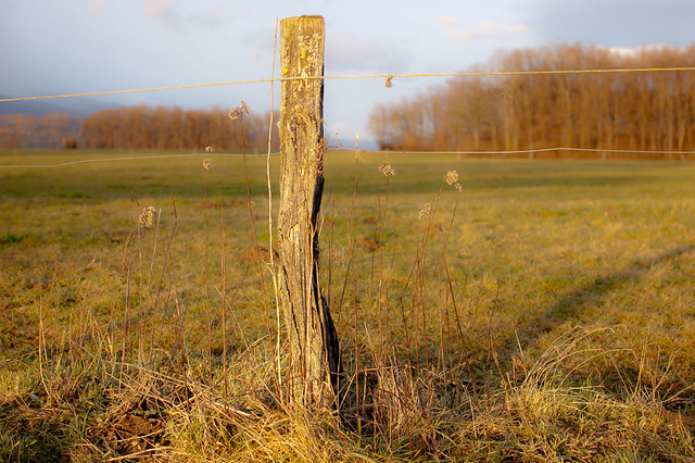
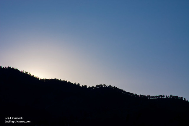
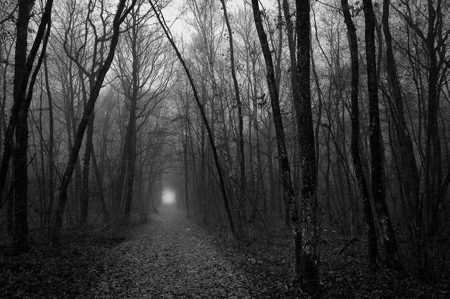
I'll show off that initial success. First, the poor showing, if you couldn't get over to that link I put above. I'll put it small, because it's really ugly, and I don't want to hurt your eyes.
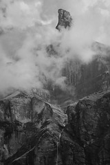
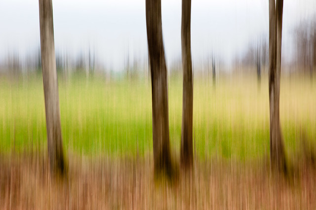
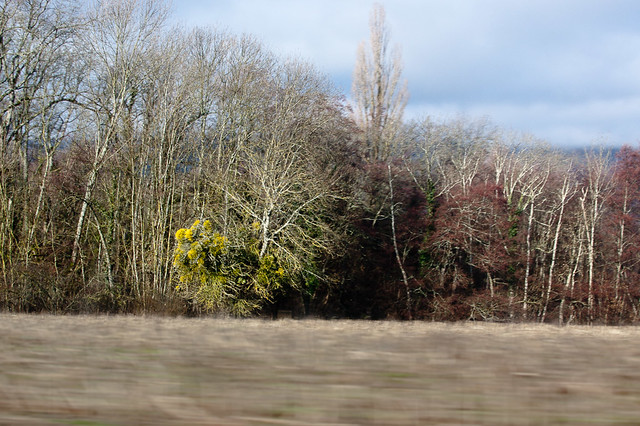
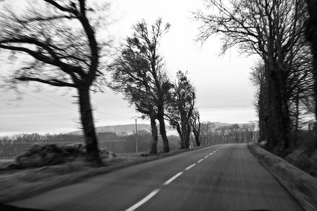
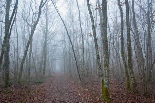
Cornes Du Chamois

Cornes du Chamois

France (2011)

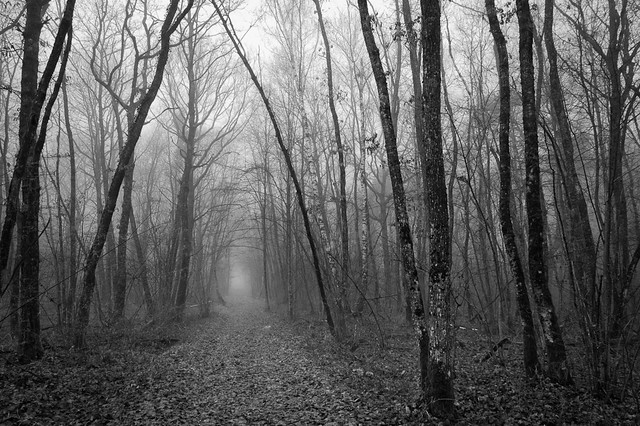
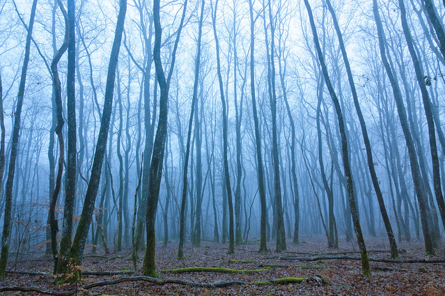
After the suggestion that this image could be a lot better with just a little tweak, I got this (bigger, 'cause it's better)
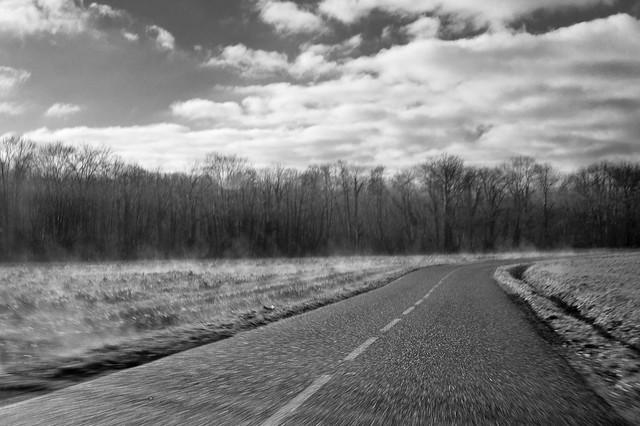
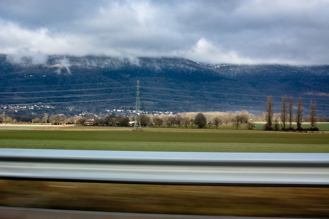
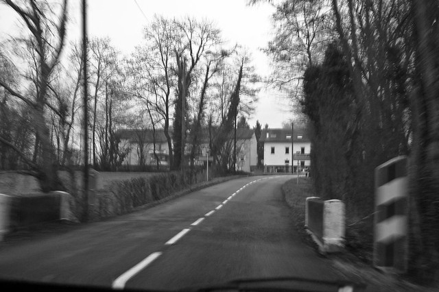
Cornes du Chamoise (repro)

Cornes du Chamois

France (2011)

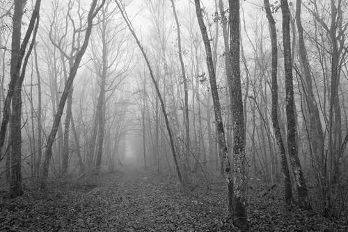
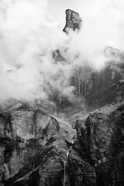
It's better, but still doesn't feel up to snuff for me. Just for your information, that second version took me quite a while, not hours and hours, but probably a couple of hours. I learned some from that.
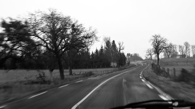
Cornes du Chamois (repro, again)

Cornes du Chamois

France (2011)

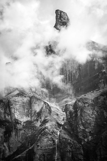
You can probably guess that I like this picture and really want it to look good. After this play around (again), I think I might have had enough for a while. It's still not as good as I'd like it to be, but that might be because of the photographers camera skills at the time rather than the postpro skillz.

A final word on the beta-ness of the LR4 beta. I'd classify it as "definitely beta". It's worked great on the first image I tried. But it crashed over and over on the second image. Enough that I gave up and deleted that image from the LR4 beta library. I'll wait for beta2 to work on that one. And one more thing, just to be clear, don't work on your original files with the beta, make a copy and import the copy.

January 9, 2012

Bicycles

January 9, 2012

Hanging Bicycles

Hanging Bicycles

Switzerland (2012)

January 8, 2012

Abstracts

January 8, 2012

Abstract Reflections

Reflection

Switzerland (2012)

Abstract Paint I

Abstract Paint I

Switzerland (2012)

Abstract Paint II

Abstract Paint II

Switzerland (2012)

January 7, 2012

Split Tone

January 7, 2012

These are the first two pictures I actually used the 'split-tone' tool on in LightRoom (LR). I think they look alright. They're from my 'lost in the woods' set. At the the flickr pages, there are full size versions, appropriate for using as desktop backgrounds.

Mysterious Place (split tone, big)

Mysterious Place

France (2011)

It's a reprocess of this image, which also has a couple of other versions (1, 2).

Field Void (split tone, big)

Field Void

France (2011)

It's a reprocess of this image, and bigger.

Happy Saturday!

search