January 11, 2012
I made it onto The Discerning Photographer's photo critique again. :)
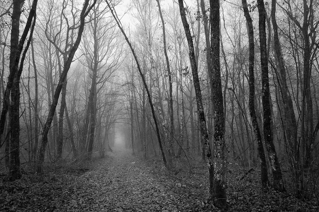
And Looked for a Way Out
France (2011)
Andrew didn't like my caption very much, or maybe I'm feeling the critics arrow on that one. I suppose thats the first thing I'd like to respond to. I usually give my picture either very literal (boring) subtitles, or rather whimsical subtitles. I expect that those can be rather difficult to understand, at least until I get better at evoking a response from the reader (in the duChemin sense of the word). Honestly, when I first started "seriously" pursueing any art form (happened to be painting) many years ago, I was inclined to name my pieces with numbers, as in a sequence, because what the heck do you name a abstract art piece? Now I name them whatever I feel like, whatever feeling I have toward the piece. Maybe I'll keep those names to myself sometimes, maybe not. Either way, I think it's important for the artist/idividual/human to name it however they wish, and stick with it in the face of critics. The title is a marker, a piece of the art and a part of the act of creation. Only take it back if you feel like it, exclusive of the pressure from outside.
Andrew's other comments are on the processing, which I fully believe I could use a lot more learning in, even today. Even after what I said yesterday. I definitely know more now than I did this summer, but I wouldn't say I really know what the heck I'm doing. So, let me just quote him here:
This is a nice image that would be better with a more interpretive toning job, in my opinion: I’d like to see the trees darkened to enhance the sense of foreboding and the foggy vanishing point brightened in contrast to the rest.
Some of this is a little funny to me, because I've already darkened the image from what I had at first. See here, a small version:
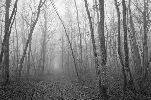
And looked for a way out (first b&w version)
Much lighter. And to the "original" color version:
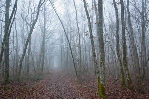
And looked for a way out (color)
Maybe I was so subtle in my processing that you can't tell, but I've actually done both of the suggestions, and lightened the road some too up in the first (top) picture. But, knowing that I don't know everything, I revisited this image again, threw caution to the wind and really burned that exit hole, dodged the forest (okay, just lowered the exposure slider to -0.8 in LR). Here it is:
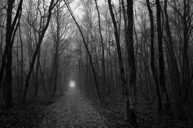
The Way Out (for the Discerning Photographer)
I think it looks quite dark, but it might look quite nice this way when printed. It's hard for me to tell when images start to get dark. It's somewhere else that I'm struggling. Anyway, thanks Andrew!